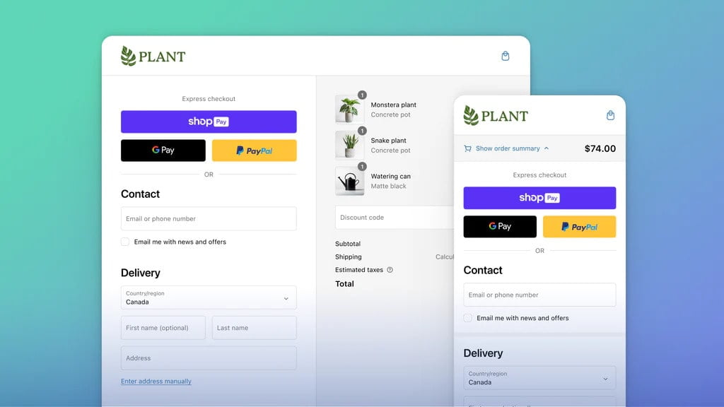
In the ever-evolving landscape of online business, where smartphones and tablets have become the go-to devices for many, mobile conversion rate optimization is no longer an option; it’s a necessity. Your ability to turn mobile visitors into loyal customers can make or break your digital marketing efforts. With mobile devices accounting for a significant portion of web traffic, businesses must prioritize mobile conversion rate optimization to stay competitive.
The Mobile Conversion Imperative
The transition from desktop to mobile is no longer a trend; it’s the new reality. Mobile devices are where prospective customers conduct their initial searches and make crucial decisions. Ignoring this shift in consumer behavior is detrimental to your business’s long-term success.
Mobile vs. Desktop: The Shifting Landscape
Statistics from July 2021 demonstrate that mobile’s share in web traffic is on a steady rise, accounting for 58.5%, while desktop stands at 41.5%. This growing gap between mobile and desktop usage signifies a significant shift in user behavior. Businesses that adapt their conversion strategies to cater to this change stand to gain a considerable advantage.
SEO Benefits of Mobile Conversion Optimization
Google’s algorithm gives preference to websites that offer optimal mobile user experiences. By enhancing mobile conversion rates, you not only improve your users’ journey but also boost your chances of ranking higher in search engine results. So, mobile conversion rate optimization is not just a user-focused strategy; it’s an essential part of a comprehensive SEO plan.
1. Optimize Font Sizes
When mobile users land on your site, they should not be squinting or endlessly scrolling to read your content. Proper font optimization ensures that your message remains clear and easily accessible on smaller screens.
Ensure Readability on Mobile Devices
To prevent users from zooming in to read your text, adjust font sizes to ensure readability. Your content should fit the screen, allowing readers to digest it comfortably.
Implement Responsive Font Scaling
Utilize media queries to dynamically scale fonts based on the device’s screen size. This ensures that your text remains legible across various mobile devices.
Prevent Content Overlaps
Large fonts may inadvertently push essential elements off the screen. Employ responsive design practices to prevent content overlap and maintain a user-friendly layout.

2. Justify or Left-Align Your CTAs
Your Call To Action (CTA) is the most vital element on your page, directing users toward the desired action. Make sure your CTAs are prominently displayed.
Make CTAs More Noticeable
Left-align or justify your CTAs to occupy more screen space and make them more conspicuous. An eye-catching CTA is more likely to drive conversions.
Leverage User Eye Patterns
Studies reveal that readers, particularly in Western cultures, tend to scan content in an F-shaped pattern. Ensure your CTAs align with these eye-tracking patterns for better visibility.
Effective CTA Placement
Position your CTAs strategically by guiding users’ attention from the top or bottom of the screen. Minimize distractions and use white space to focus on specific CTAs.
3. Accelerate Page Loading Speed
Mobile users value speed and efficiency. Slow-loading pages can lead to high bounce rates and missed opportunities. Enhancing your site’s loading speed is paramount for mobile conversion optimization.
Minimize Loading Time for Mobile Users
Google’s “Core Web Vitals” emphasizes the combination of speed and user experience. Prioritize these metrics to improve your website’s performance on mobile devices.
Browser and Server Optimization
Optimize your site’s server performance, code quality, and static file delivery (e.g., images, HTML, and CSS). Fast-loading pages not only improve user experience but can positively impact search engine rankings.

4. “Hide” Copy-heavy Sections In Drop-downs
Save space and create a sleeker mobile experience by categorizing and placing sections in collapsible drop-down menus.
Streamline Information Presentation
Organize blog categories or services into drop-down menus. Users can access more information with a simple tap, making your content more manageable.
Enhance User Experience
Hide FAQ sections or lengthy content blocks behind drop-downs for a cleaner, more focused user experience. This approach minimizes clutter while providing quick access to additional details.
Effective Usage of Collapsible Menus
Mobile visitors appreciate well-organized and efficient layouts. Utilize collapsible menus to present your content in a user-friendly way while saving valuable screen space.
5. Simplify Navigation Options
Mobile users should have access to the most relevant and essential links, rather than an overwhelming array of choices. A simplified, clean interface improves user engagement and increases conversions.
Focus on Relevance and Clarity
For mobile conversion optimization, display only the links that are pertinent to the user’s context. Remove any extraneous links that may distract or confuse visitors.
Remove Unnecessary Links
Unclutter your mobile pages by eliminating links that are irrelevant or less likely to lead to conversions. A streamlined menu increases clarity and helps users make quicker decisions.
Optimize for Touchscreen Navigation
Design your navigation for touch-friendly interaction. Ensure that clickable elements are appropriately sized and spaced, preventing accidental clicks and enhancing user experience.
6. Optimize Visual Content
Visual elements play a crucial role in capturing users’ attention and conveying your message. Proper optimization of images and videos is essential for mobile conversion rate optimization.
Enhance Image and Video Performance
Compress images and videos without sacrificing quality. Smaller file sizes reduce loading times while maintaining visual appeal.
Implement Lazy Loading
Lazy loading ensures that images and videos are loaded only when users scroll down the page. This approach conserves bandwidth and accelerates page loading speed.
Reduce Visual Clutter
Maintain a clean and uncluttered visual environment. Eliminate any unnecessary graphics or content that might distract users from your CTAs.
7. Fix Your CTA to the Bottom of the Viewport
To maximize conversion opportunities, anchor your Call To Action (CTA) at the bottom of the viewport. This keeps the CTA in view as users scroll down the page.
Ensure CTA Visibility While Scrolling
With a fixed CTA at the bottom of the screen, users can access it at any point during their scroll. This persistent visibility increases the likelihood of engagement.
Increase Conversion Opportunities
A CTA positioned at the bottom of the viewport remains easily accessible, prompting users to take action at their convenience. This is especially effective for long-form content.
User-Friendly Mobile Interaction
Anchored CTAs enhance the overall user experience. Visitors can engage with your offers without the need to scroll back to the top of the page.

8. Streamline Checkout Process
For e-commerce sites, the checkout process is a pivotal stage where users decide to make a purchase. A streamlined and user-friendly mobile checkout process can significantly impact your conversion rates.
Minimize Steps to Conversion
Reduce the number of steps required for a user to complete a purchase. Simplify the checkout process to minimize friction and encourage conversions.
Implement Guest Checkout Option
Allow users to make a purchase without creating an account. Offering a guest checkout option simplifies the process and caters to users looking for a quick transaction.
Use Mobile-Friendly Payment Methods
Ensure that your payment methods are mobile-optimized. Mobile wallet options and other convenient payment methods can expedite the checkout process.
Eliminate Unnecessary Form Fields
Only collect essential information during the checkout process. Reducing the number of form fields minimizes user effort and improves the conversion rate.
Optimize for Mobile Payment Wallets
Facilitate payments through mobile wallets like Apple Pay and Google Pay. Integrating these options provides users with a seamless and familiar payment experience.
9. Implement Geotargeting for Personalization
Geotargeting allows you to deliver personalized experiences and offers based on the user’s location. Tailoring your content to a user’s geographical context can enhance engagement and conversions.
Geo-Personalization Strategies
Develop geotargeting strategies to connect with users on a local level. Highlight location-specific offers, promotions, or events to increase relevance.
Localized Offers and Content
Provide content and offers that resonate with users in a specific region. Localized content increases the chances of connecting with your audience on a personal level.
Privacy and User Consent
Ensure that your geotargeting practices align with privacy regulations. Seek user consent when collecting location data to maintain transparency and trust.
10. Avoid Adding Too Many Sections
While delivering value is essential, an overload of content can overwhelm users. Focus on delivering a concise, impactful message rather than inundating your mobile page with excessive sections.
Discuss the Need for a Focused and Concise Mobile Page
Highlight the significance of clarity and brevity in your mobile content. Emphasize that a focused approach can increase user engagement and improve conversions.
Embrace the Importance of a Clear Message and User Experience
A streamlined mobile page delivers a clear and impactful message. Users can quickly grasp the benefits you offer without being bogged down by an excessive amount of information.
Final Thoughts
As we navigate the dynamic world of online commerce, mobile conversion rate optimization emerges as a pivotal force that can redefine your digital success. With the mobile landscape continuously evolving, focusing on these ten distinct strategies can be your pathway to enhanced conversions, engaged customers, and amplified growth.
If you’re eager to discover every potential area for improvement on your mobile site, consider a Page Roast. Our expert team will provide you with a personalized video filled with actionable insights, guiding you toward mobile success.
Don’t miss the opportunity to maximize your mobile conversions and stay ahead in the mobile-first era.


