In the fast-paced world of online marketing, landing pages play a pivotal role in your quest to engage, convert, and retain your audience. They are the digital front doors to your business, where your audience decides whether to walk in or simply move on. However, several common landing page issues can significantly hinder your conversion rates, sometimes more than you might realize. Fear not, though, as we’re here to address these concerns and provide actionable strategies to tackle them. Let’s delve into the realm of common landing page issues and the art of fixing them to boost your conversion rates.
What Are Landing Pages?
Landing pages are the linchpin of your online marketing efforts. They are the pages where you guide your audience to take specific actions, whether it’s signing up for your newsletter, making a purchase, or requesting a quote. When executed well, they can be conversion gold mines. However, all too often, even the most well-intentioned landing pages suffer from issues that deter conversions.

1. Slow Page Load Times: The Silent Killer
Why Slow Loading Pages Wreck Conversion Rates
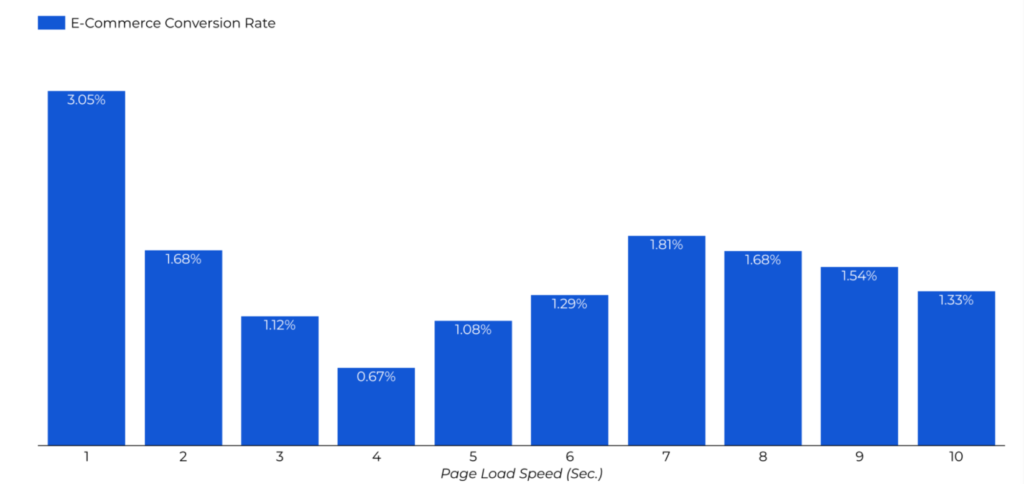
The need for speed cannot be overstated when it comes to online experiences. Slow-loading pages are one of the primary conversion killers. The average internet user is accustomed to blazing-fast load times, thanks to high-speed connections and powerful devices. Therefore, a sluggish page not only annoys your audience but can lead to immediate abandonment.
When visitors encounter slow pages, they are more likely to hit the back button, searching for a faster solution elsewhere. Google research shows that a delay of just three seconds can lead to a 53% increase in page abandonment. This statistic alone illustrates the significant impact of page load times on conversions.
Optimizing Images and Minimizing Resource Requests
Optimizing your images and reducing resource requests is a great place to start. Compress images to an appropriate size without compromising quality, and employ formats like WebP that offer excellent compression and quality. Minimizing the use of scripts and third-party resources can also improve your load times of landing pages.
Leveraging Browser Caching and Content Delivery Networks
Additionally, leverage browser caching to store frequently used resources on your visitor’s device, reducing the need to reload them on every visit. Implementing a Content Delivery Network (CDN) further accelerates load times by distributing content across multiple, strategically located servers.
Conducting Regular Performance Audits
Regularly perform performance audits using tools like Google’s PageSpeed Insights to identify specific issues that might be affecting your page load times. Audit results will often include actionable recommendations, which can serve as your roadmap to faster-loading landing pages.

2. Lack of Clear and Compelling Value Proposition
The Crucial Role of a Value Proposition
Your landing page must instantly communicate its purpose and the benefits it offers. This is where the value proposition comes into play. A value proposition is a concise statement that clearly conveys what your product or service does, how it solves a problem, and why it’s better than the alternatives.
Crafting a Unique Selling Proposition (USP)
One of the key elements of a compelling value proposition is a Unique Selling Proposition (USP). Your USP highlights what sets you apart from the competition, demonstrating why visitors should choose your product or service on your landing pages.
Testing and Refining Your Value Proposition
Crafting the perfect value proposition often requires testing and refinement. Conduct A/B tests to evaluate different value proposition variations. Monitor user behavior to determine which resonates most effectively with your audience.
Real-life Examples of Effective Value Propositions
For inspiration, consider the USPs of successful brands like Apple, Uber, and Dropbox. Apple’s “Think Different” campaign and Dropbox’s “Your Stuff, Anywhere” motto are memorable examples of compelling value propositions on landing pages.

3. Cluttered and Confusing Page Design
The Importance of a Clean and Intuitive Layout
Landing pages should embrace simplicity and follow best practices. A cluttered and confusing design overwhelms visitors, making it challenging for them to find the information they seek or take the desired action.
Decluttering with Strategic Use of Whitespace
Whitespace, or negative space, plays a critical role in design. It creates visual breathing room, ensuring that your content is easy to read and understand. Embrace whitespace to declutter your landing page.
Streamlining Navigation for a Seamless User Journey
Navigation menus on landing pages can often lead visitors away from the intended conversion path. To create a seamless user journey, eliminate unnecessary navigation elements and focus visitors on the specific action you want them to take.
Simplifying Forms and Minimizing Distractions
Forms, a common feature of landing pages, should be as straightforward as possible. Remove unnecessary fields and distractions to streamline the conversion process.
Completing the form should feel like a breeze, not an obstacle course.

4. Weak or Misplaced Calls to Action (CTAs)
The Power of Well-Placed CTAs
Calls to action (CTAs) are the gateways to conversions. Weak or misplaced CTAs can result in missed opportunities on your landing pages.
Crafting Irresistible CTA Copy
Compelling CTA copy is essential. Make your CTAs action-oriented and solution-driven. Use persuasive language that prompts visitors to act immediately.
A/B Testing for CTA Perfection
A/B testing is your best friend when optimizing CTAs. Experiment with different CTA button colors, shapes, sizes, and positions to discover what resonates most with your audience.
Using Color Psychology for CTA Buttons
Understanding color psychology can help you make informed decisions regarding CTA button colors. Different colors evoke specific emotions and reactions. For instance, red signifies urgency, while green conveys security. Experiment with various colors to see what aligns best with your goals.

5. Ignoring Mobile Responsiveness
The Mobile-First Imperative
The world has gone mobile. More people access the internet from mobile devices than ever before. Ignoring mobile responsiveness is a cardinal sin in today’s digital landscape.
The Impact of Mobile Optimization on Conversions
Mobile optimization is not merely a convenience; it’s a necessity. Mobile-unfriendly landing pages lead to high bounce rates, as visitors on smartphones and tablets quickly abandon pages that don’t render well on their screens.
Strategies for Mobile-Friendly Landing Pages
Optimize for mobile by using responsive design techniques that adapt your landing page to different screen sizes. Test your landing page across various devices to ensure a seamless user experience.
Testing Across Multiple Devices
User testing is crucial to discover any issues on specific devices. Leverage testing tools and gather feedback from actual users to refine the mobile user experience.
Maximize Your Conversions Today
Landing page optimization is not just a strategy; it’s a commitment to your online success. By addressing these common landing page issues, you pave the way for better user experiences, higher conversions, and increased revenue. Your landing pages should be dynamic, ever-evolving entities.
If you’re looking to make sure you truly haven’t missed anything, a Page Roast can provide you with invaluable insights to optimize your pages further, making them finely-tuned conversion machines. It’s time to take action to refine your landing pages and elevate your conversion rates.


